Otif Site Improval
UX Analysis and UI improvement proposal.
ABOUT THE PROJECT
Otif is a short-project of UX/UI website improvement
During my job search, I encountered a challenge from Otif, which I needed to complete to apply for a position. The task was to enhance their Maritime Tracker System within 24 hours. Here are the results.
By focusing on user experience (UX) and user interface (UI) principles, I redesigned the system to improve the tracking of shipments. Key enhancements included optimizing real estate usage, improving visual hierarchy and organization, and strengthening underdeveloped functions.
ROLE
UX UI Designer
ASSOCIETED WITH
Otif
DATE
March 2024
Originally, this project was crafted in Spanish due to client requirements. Though translated, be aware that certain terminologies may vary between this Book Page, the Project Presentation, Whiteboard, and Prototype.
OTIF (On Time In Full)
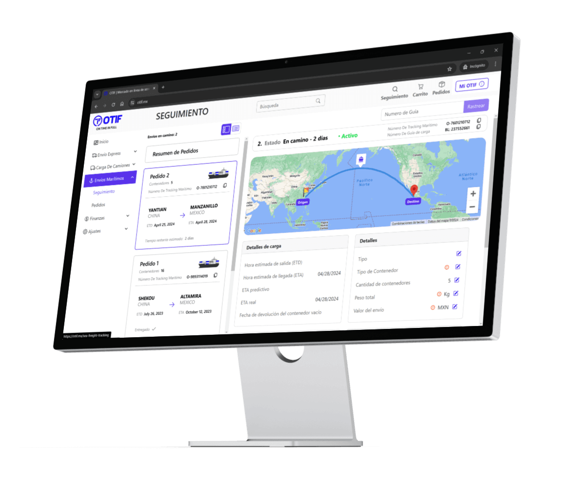
OTIF is an online service platform designed to streamline and optimize logistics and supply chain management. Modes of transportation includes express shipping, truck cargo, and maritime freight.
The platform enables users to monitor the real-time status of their shipments, offering detailed insights. By integrating tracking numbers and utilizing interactive maps, OTIF ensures that users have full visibility of their cargo's journey from origin to destination.
Objective
The goal of OTIF is to enhance operational efficiency, reduce delays, and ensure that shipments are delivered on time and in full, thereby improving overall supply chain reliability and customer satisfaction.
Exercise Deliverables
Analyze the current user flow of the main task and propose an improvement.
Analyze and propose an improvement on the Maritime Track System (both UI and UX).
Prototype the proposed ideas.

Content
Project development based on Design Thinking Methodology. All stages were completed except of Evaluate due to time constricts.
1. Methodology
2. Analysis
3. Proposals
Conclusion

Empathize
Explore the site
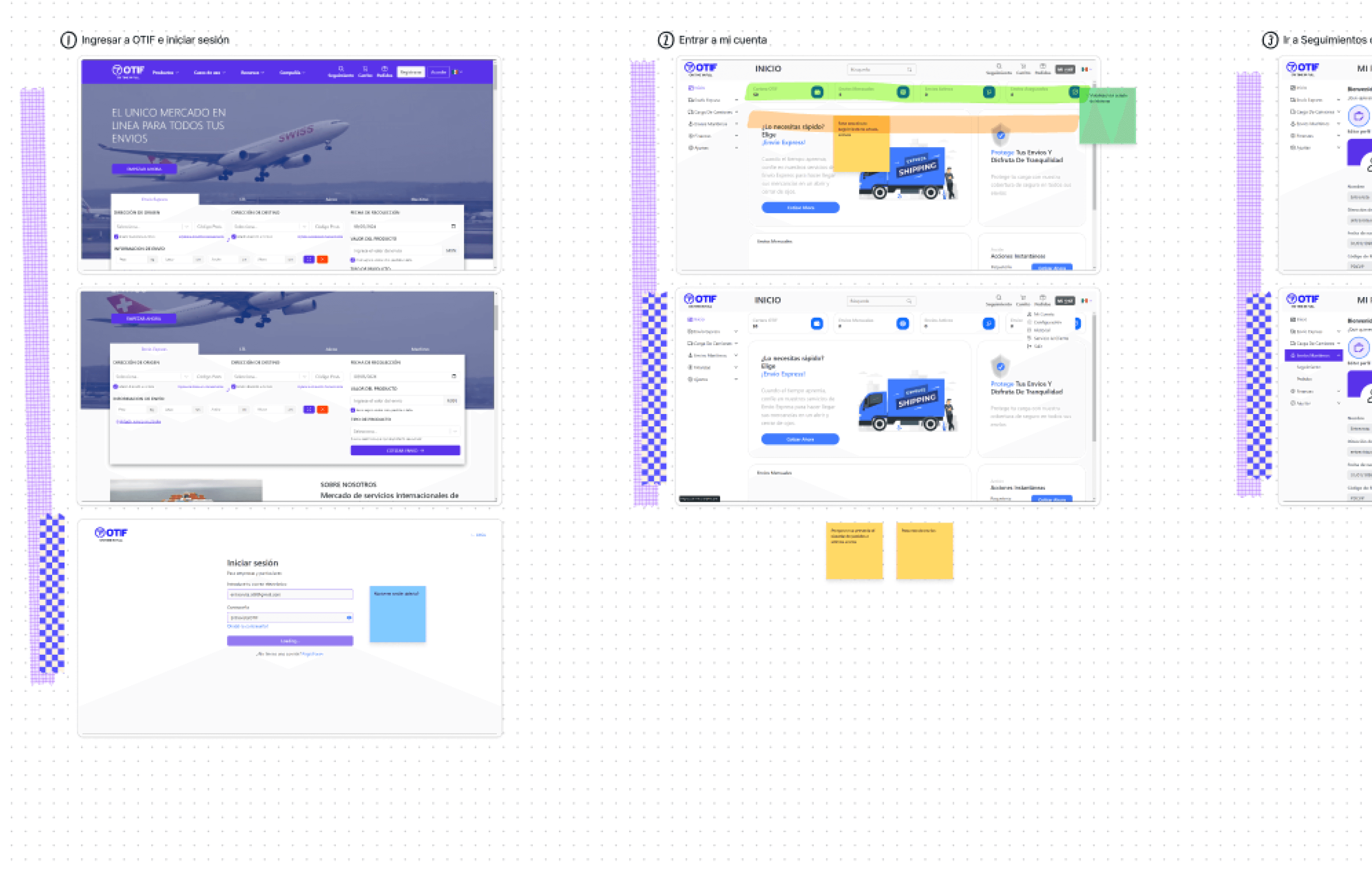
First, the page and the suggested flow for the main task of checking the maritime shipment tracking system were explored.
Enter to the Otif webpage and log in with a provided account.
Enter to “My Account”.
Go to tracking within maritime shipments.
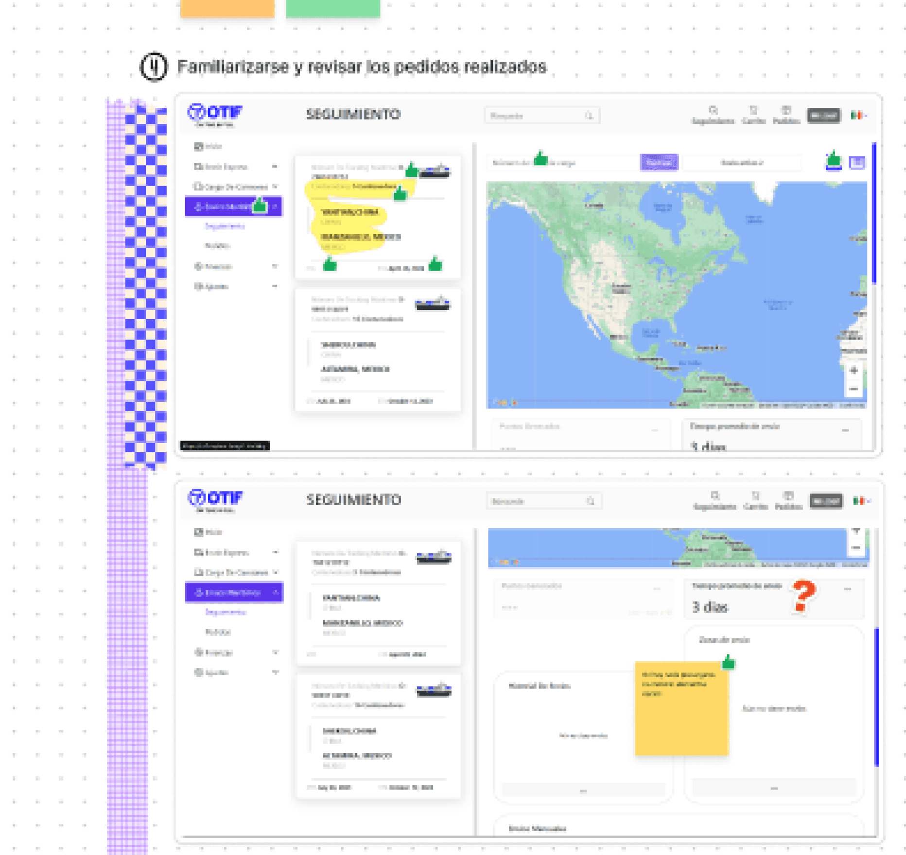
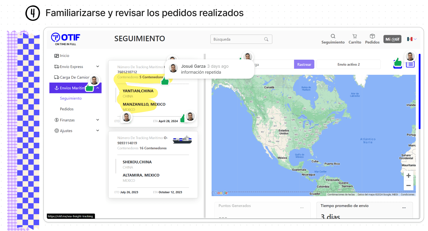
Familiarize myself and review the orders placed.
While exploring, screenshots of each page were taken and added to figjam for post-analysis.
Define
Taskflow Diagram
Based on the exploration, the steps carried out were defined in a flow chart to later on analyze step by step and identify rooms of opportunity. In total, 3 were found.
ROOM FOR IMPROVEMENT / ISSUES
It is not required to enter to “My Account” in order to select and visualize the shipment tracking.
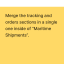
At the moment of selecting “Maritime Shipments” it is necessary to select (again) a specific order for it to be displayed.
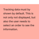
Default order information is not displayed when selecting “Tracking”.


UI Analysis
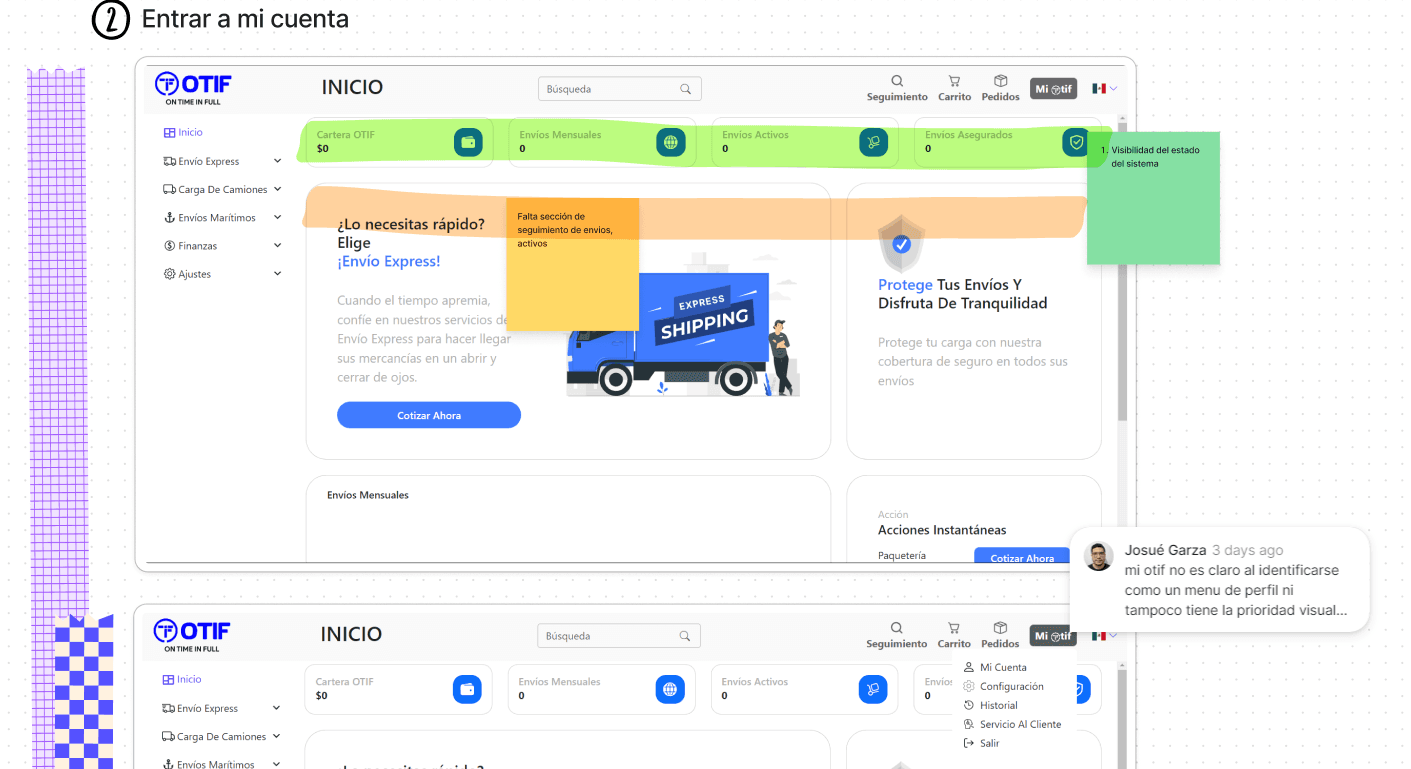
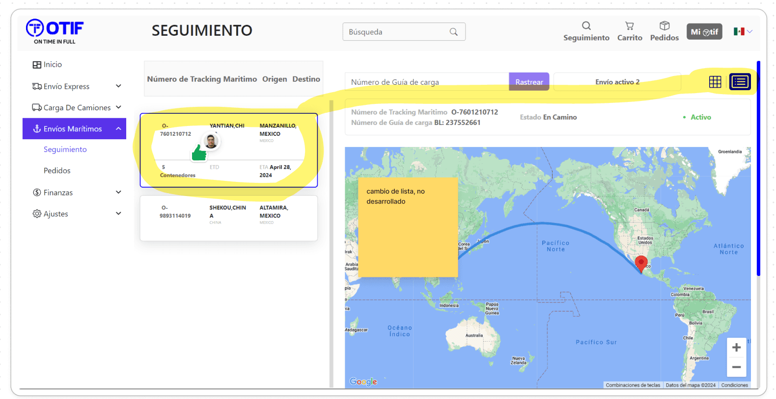
For the UI analysis, heuristics and graphic issues were identified on each screenshot, pinned with comments over the elements for correction.
Ideate
Taskflow Proposal
Once the flow chart of the main task was defined, it was rediefined improving it by reducing steps and making alternative routes for better accesibility throughout the web pages.
The next flow was proposed.
SOLUTIONS / PROPOSALS
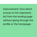
Versatility, different ways to access the order's tracking.
Direct access to maritime shipments through 3 actions:
Make a new shipping (Solution → CTA)
Check an active order (tracking)
Check the record of orders.
Tracking is the priority selection for the user because it shows the current status and relevant data of the service.
Show information of the last shipment order, the next arrival or ware value.
Prototype
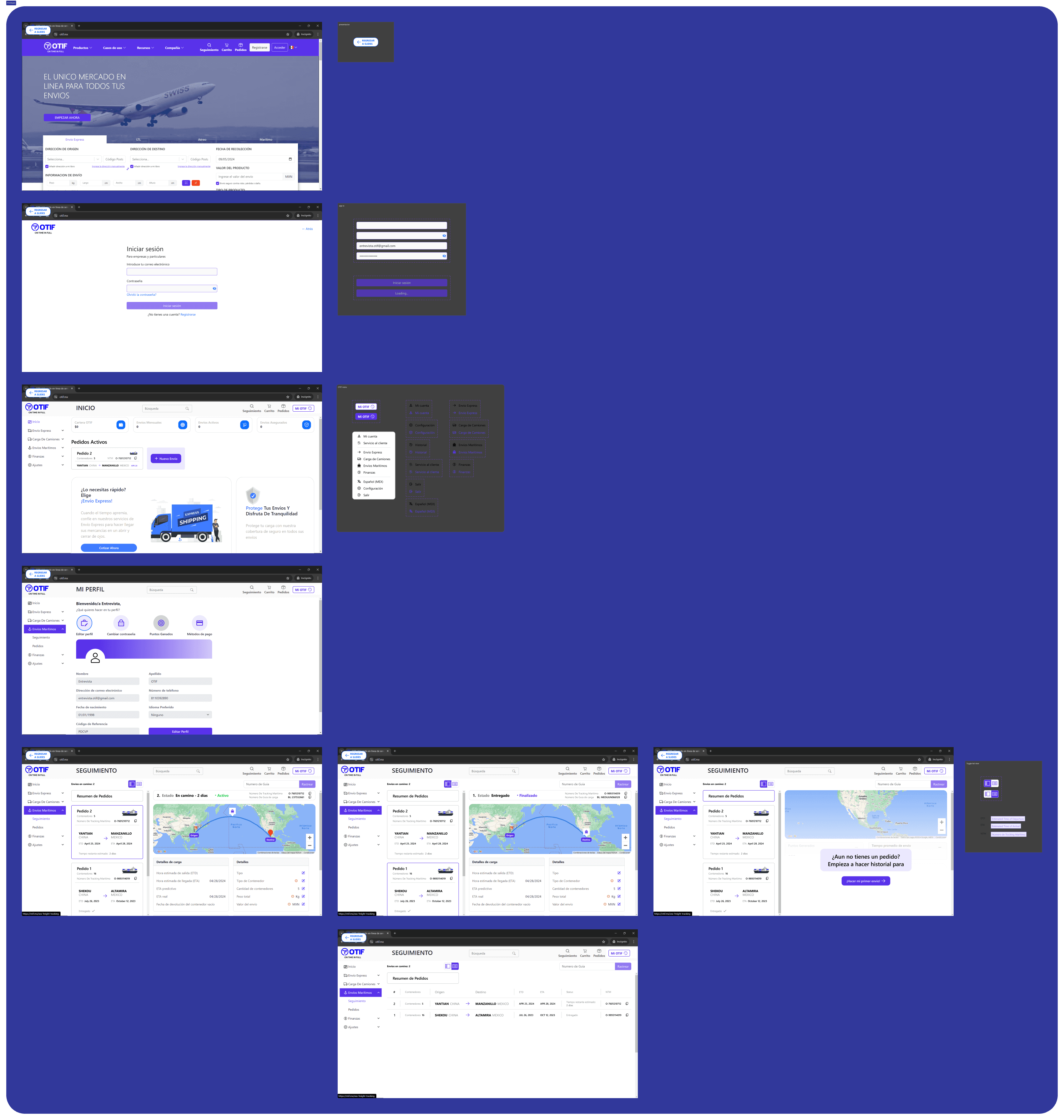
Layout Transformation
Finally, using Figma, the proposed improvements were prototyped.
Most Significant Changes
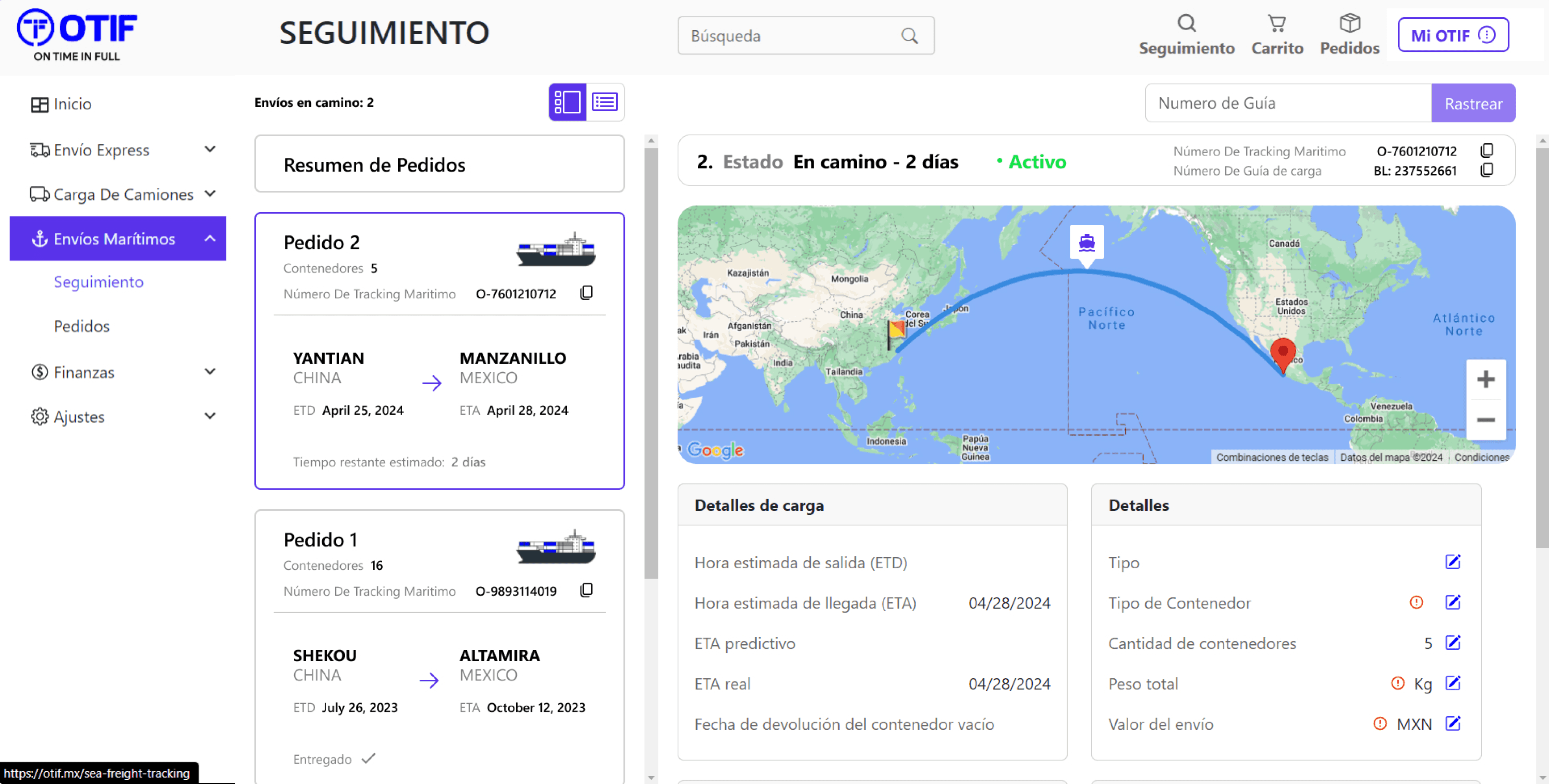
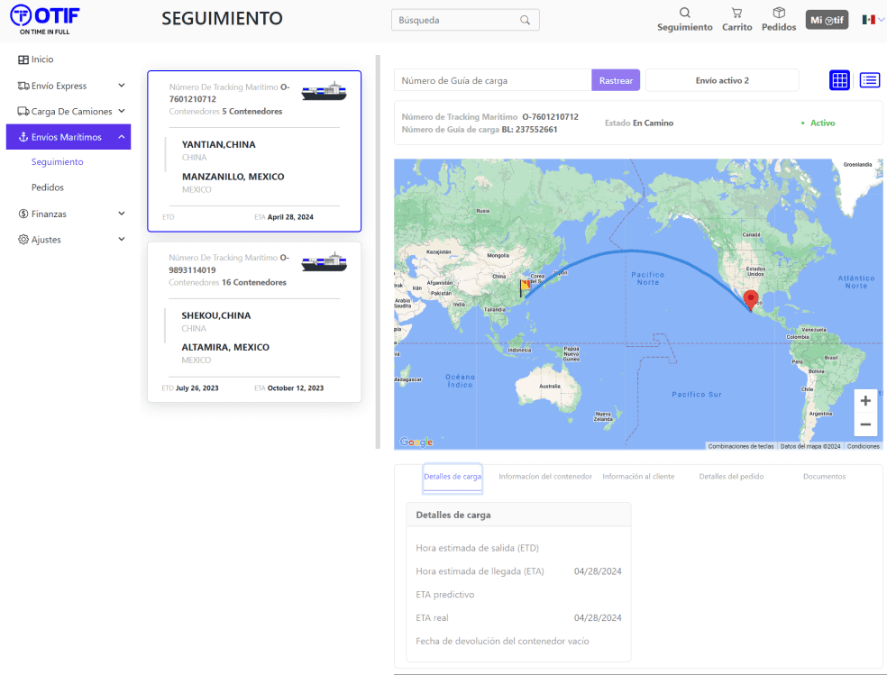
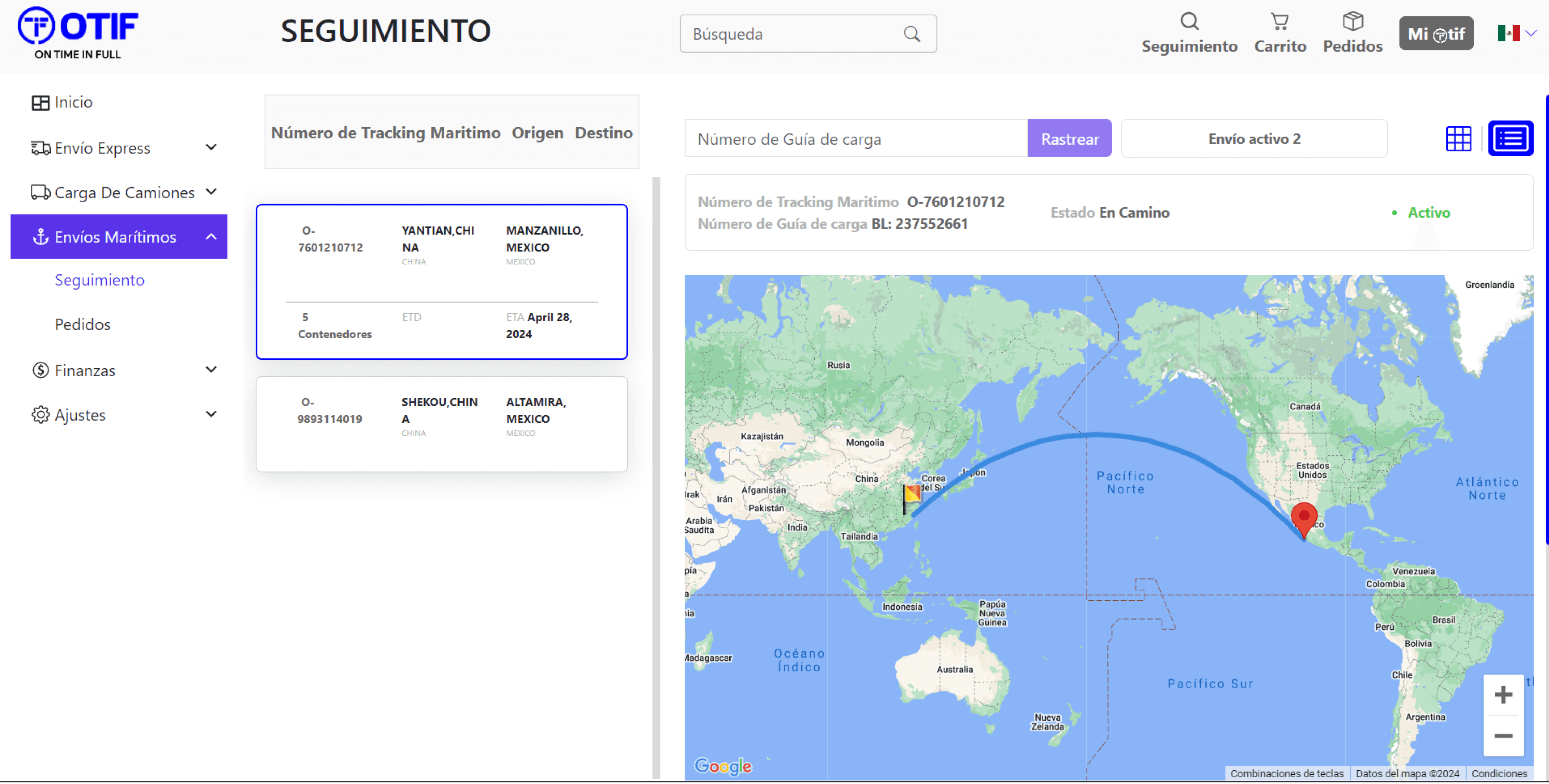
Page 1: Maritime Shipment Tracking System
2
3
1
1
2
3
Order Summary Card redesigned.
Better hierarchy and distribution of information.
Repetitions deleted.
Calculated remaining time of arrival.
Uncommon terms with alternate text when hover.
Improved architecture of information for:
View toggle button between card view or list view.
Search Bar.
Active orders.
Improved Order Details Layout
Smaller map size for optimal real space usage.
All details in one place instead of multiple bars.
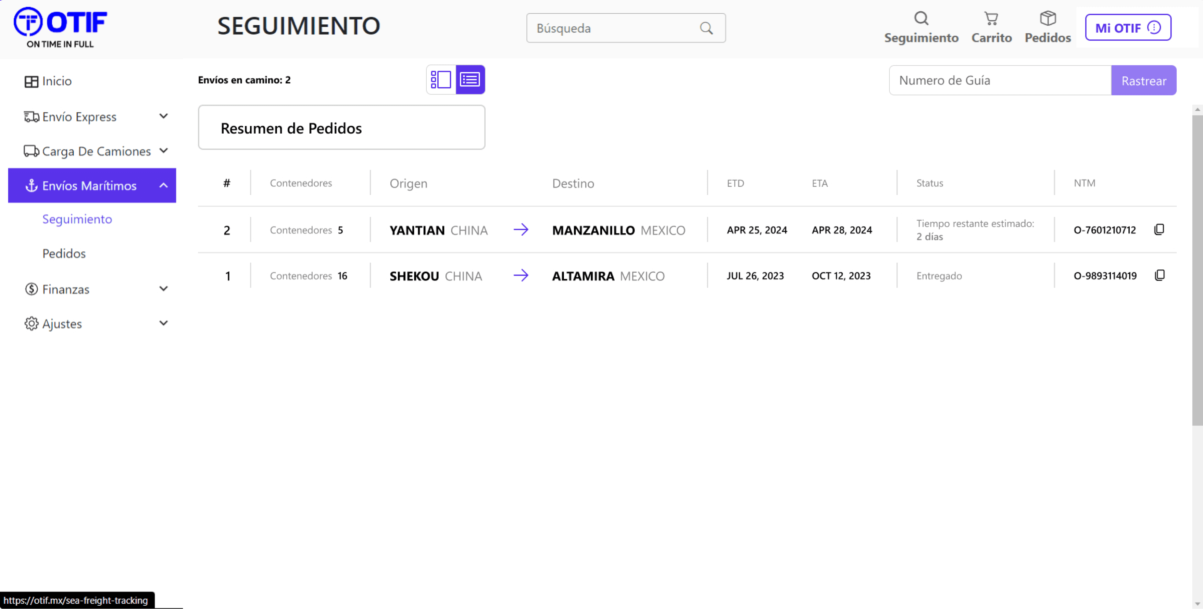
Page 2: Maritime Shipment Tracking System - List view
1
1
List view redesign.
Better consistency based on the standard.
Real list format instead of shortened cards.
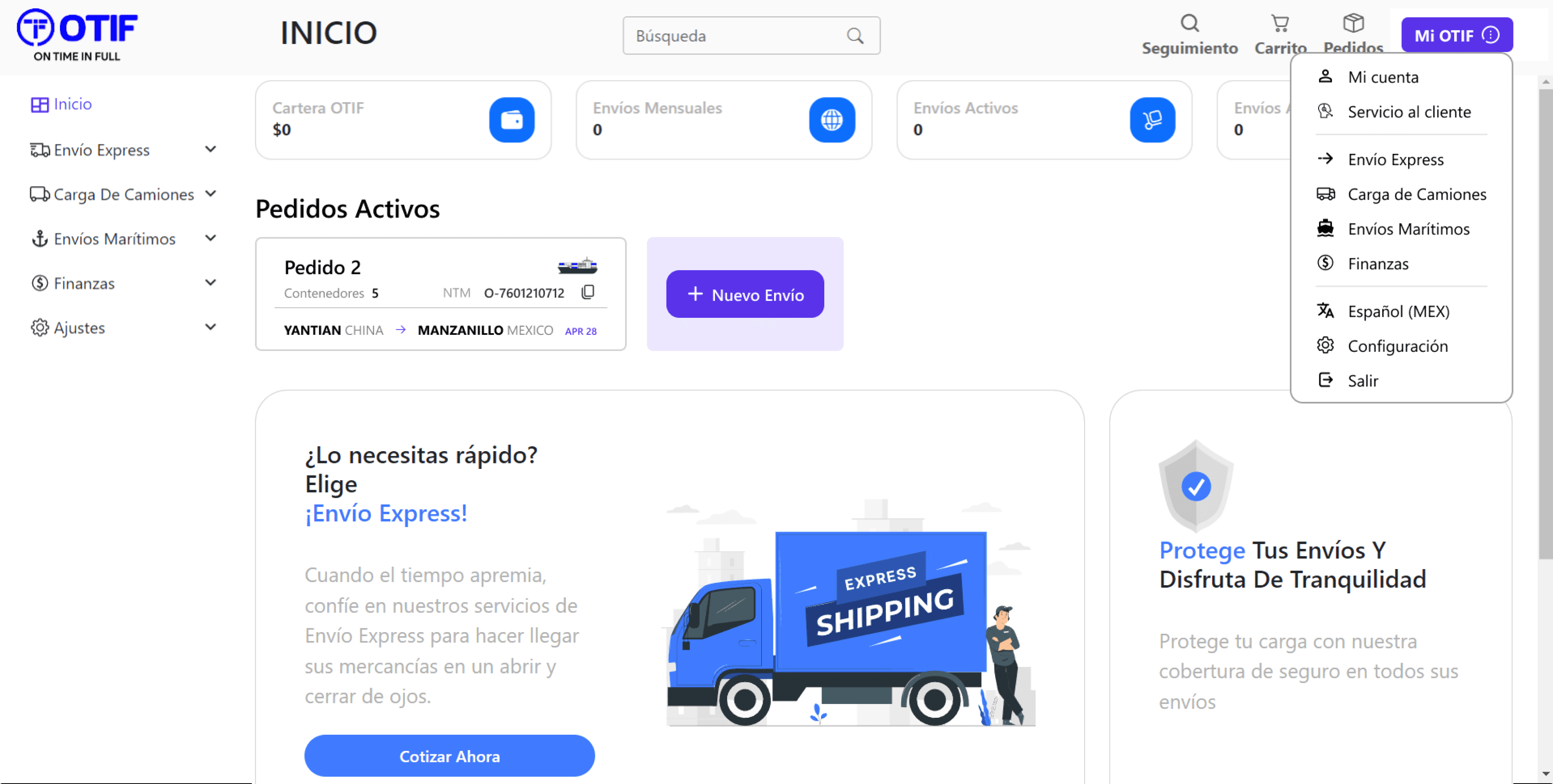
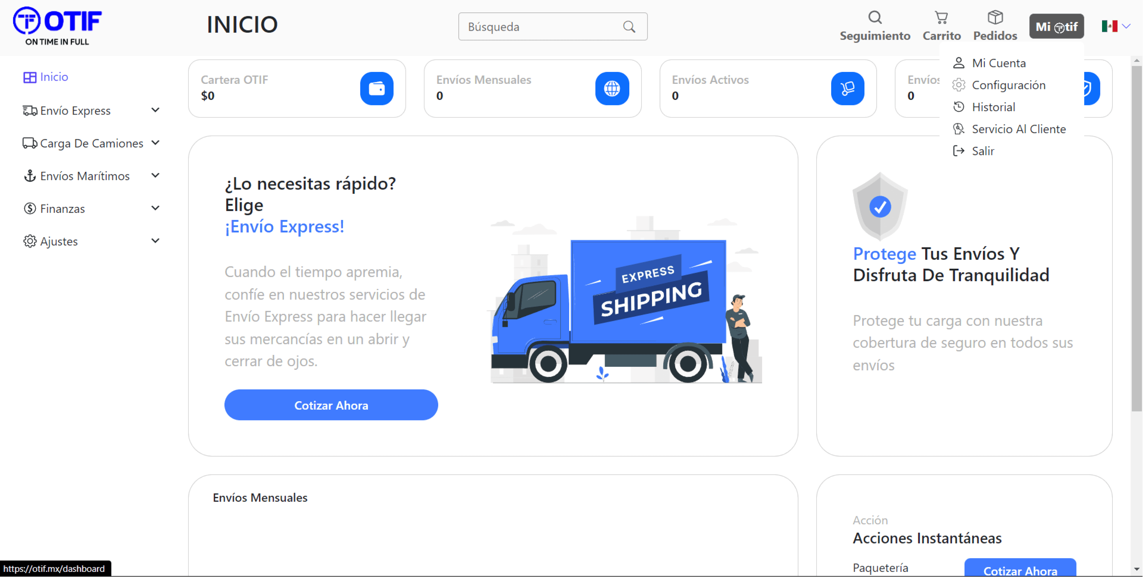
Page 3: Homepage (Signed-In)
2
1
1
Enhanced “My Otif” drop down menu with better options and sections.
Button with main color for more relevance.
Standardized icon for better recall.
Deeper contrast for the drop down menu including borders.
Nearer access to shipments.
Homepage flexibility to display current shipments.
Summary of active orders.
Option for making new orders.
Full Prototype Layout
Conclusion
Opportunity areas for improvement on the OTIF site include:
System status visibility
Flexibility and efficiency of use
Minimalist aesthetics and design
Most proposals align with these three heuristics.
Overall, it was identified:
3 elements for improvement in the UX flow
18 elements for improvement in the UI
With these UX and UI enhancements, it can be ensured an improved user experience and increased operational satisfaction for the user.