Take Control of Your Finances

Effortlessly manage your expenses anytime, anywhere.

Discover Klip
ABOUT THE PROJECT

Klip is a Financial Healthcare application

Klip holds a special place in my heart as it was my first project as a UX/UI Designer. Through this project, I took my initial steps in Figma, app design, design systems (material design), atomic design, and, most importantly, UX fundamentals.


With thorough research, an innovative design approach, and user testing evaluation, I developed this prototype app concept to help people better understand and manage their finances.

ROLE

UX UI Designer Apprentice

ASSOCIETED WITH

CoderHouse

DATE

March 2022 - July 2022
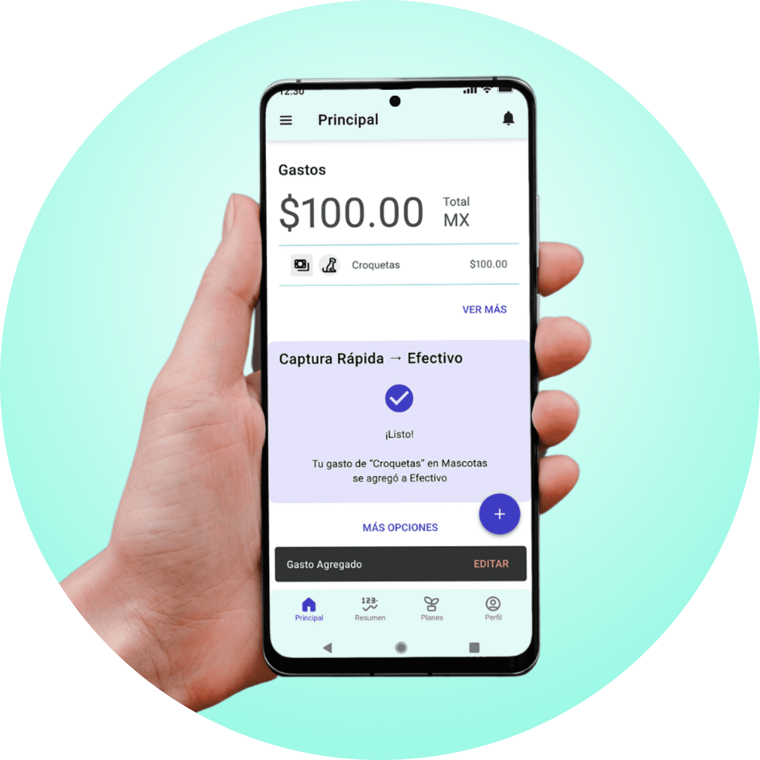
REGISTER and MANAGE your expenses easier and faster than ever

REGISTER and MANAGE your expenses easier and faster than ever

3 Steps Inputs

3 Steps Inputs

  • Quantity

  • Concept or Category

  • Enter!

  • Quantity

  • Concept or Category

  • Enter!

Robust Reports

Robust Reports

  • Analysis

  • Statistics

  • Graphs

  • Analysis

  • Statistics

  • Graphs

Register your expenses everywhere you go and manage them later

Register your expenses everywhere you go and manage them later

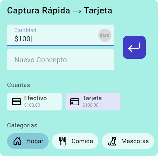
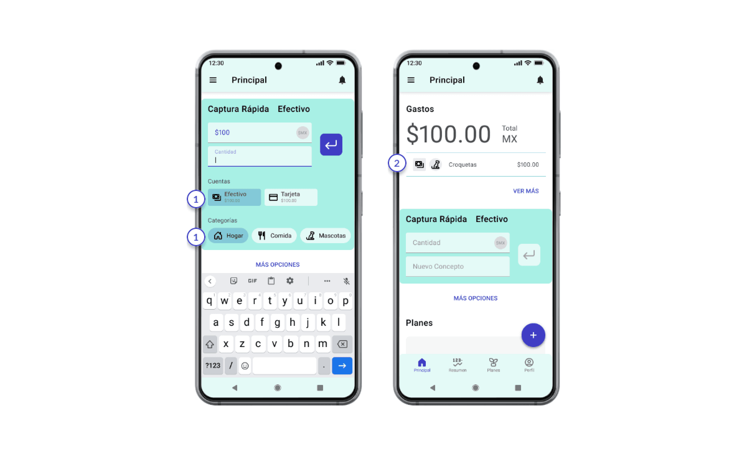
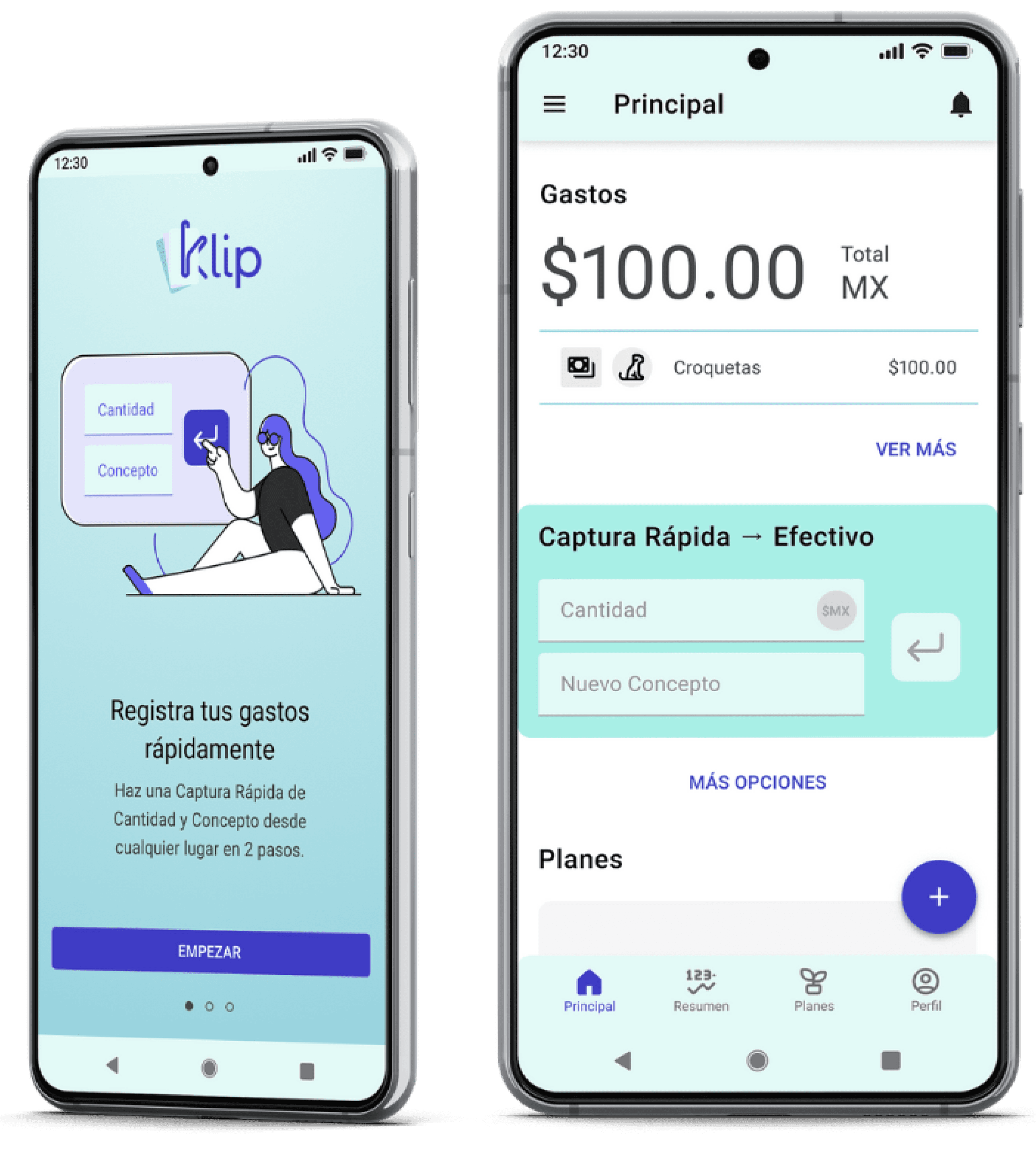
5 to 10 seconds to seamless register a new expense with 2 manual inputs helped by auto-selections.

5 to 10 seconds to seamless register a new expense with 2 manual inputs helped by auto-selections.

2 Manual Input

2 Manual Input

2 Auto Selections

2 Auto Selections

Quantity

Quantity

Concept

Concept

Account

Account

Category

Category

Improve your finances with meaningful reports

Improve your finances with meaningful reports

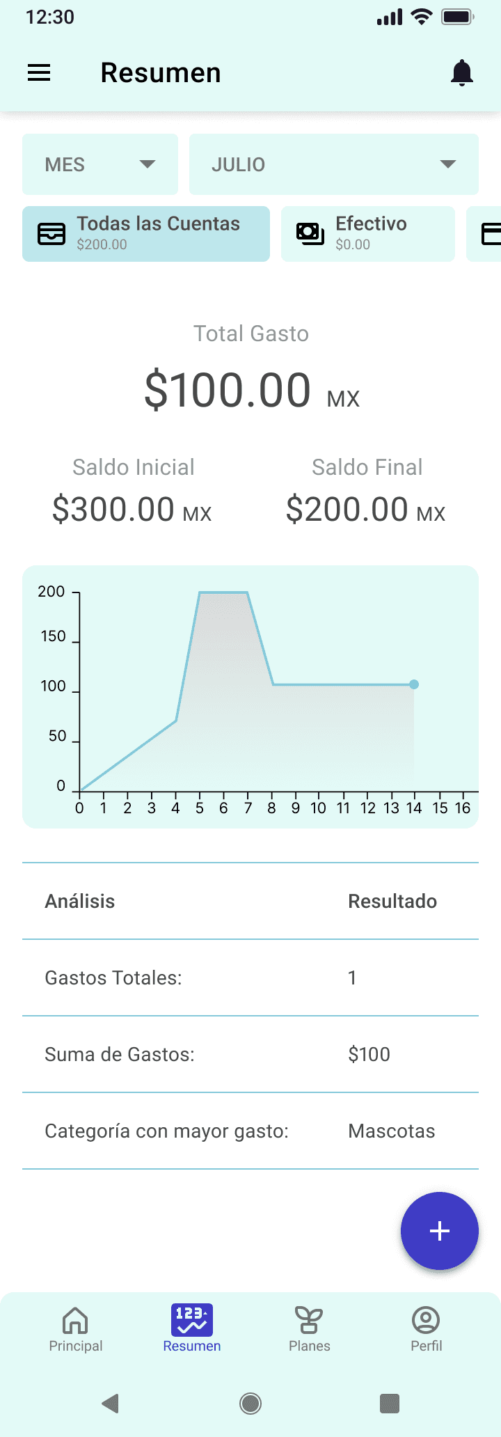
Monthly analysis with meaningful visuals and smart statistics.

Monthly analysis with meaningful visuals and smart statistics.

Insights

Project Brief

Project Brief

User Analysis

User Analysis

POV

POV

Project Brief

A large portion of the young and adult population from Latin America lacks of a proper financial education despite having free access to a it. According to El Economista and Forbes, 4 out of 10 adults experience daily concerns for their financial situation.


This situation leads them to live at the limit of their profits and expenses, which of both, lose control and trajectory easily. The main obstacle is maintaining a record of the expenses made during the day or the week.


The current available apps don't help the users to achieve this goal. Multiple steps to register an expense, confusing Ui with poor aesthetics, and overall engaging experience make the user prefer evade making a simple task.

Proto-personas and User-Personas Analysis

Right assumptions
  • Users frequently make expenses without registering.

  • Users wish for a better control of their finances.

  • Users most probably will have heavy expenses in the near future.

Wrong assumptions (corrected)
  • Users do not have a current concern for future expenses.

  • Users have a basic kind of financial organization.

  • Users did know about finances, at least a bit of it.

POV - What does the user needs?

Israel (stakeholder) is a QA Tester since 2 years ago. He partially contributes to the house expenses. Frequently, he visit his friends to play boardgames paying Ubers and food.


He needs to start managing his expenses effortlessly because when he do his finances at the end of the month he finds out he doesn’t remember his spendings.


Because he has the objective of making himself discipline to maintain healthy finances.

"For frequent transactions, an effortlessly accessible on-the-go expense manager app is ideal for developing and maintaining healthy finances."

Ideation

MVP

MVP

Information Arquitecture

Information Arquitecture

Taskflows

Taskflows

Minimum Viable Product (MVP)

Based on the user´s POV, the essential app functions for the user to perform in order to satisfy his necessities were defined.

Release Version
1st Stage
Record expense
  • Input quantity

  • Specify concept

  • Input quantity

  • Specify concept

Goal: record expenses.
2nd Stage
Show financial report
  • Select summary

  • Select lapse of time

  • Select summary

  • Select lapse of time

Goal: manage the expenses.

Information Architecture
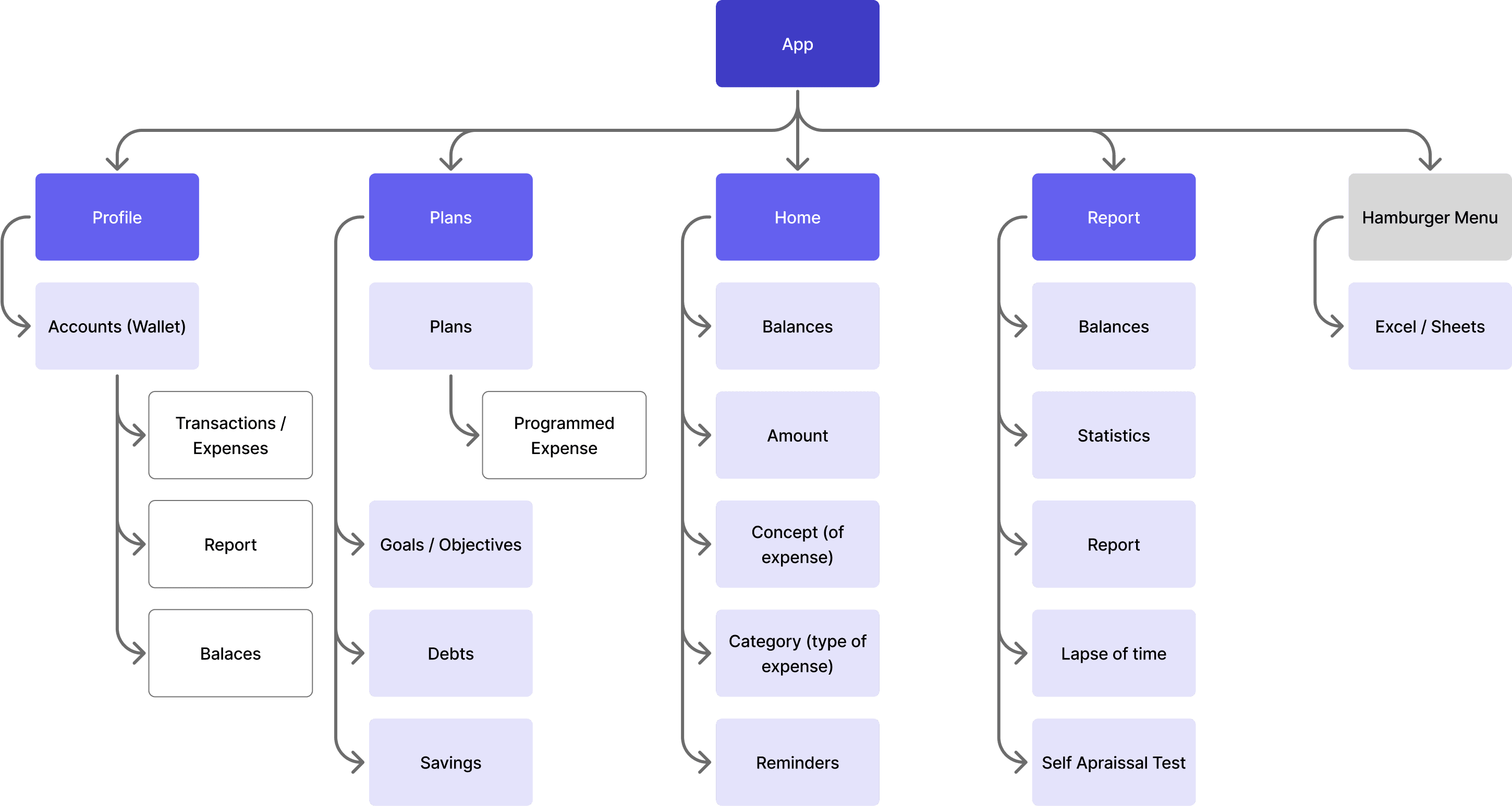
Taskflows

User´s happy paths from the MVP´s 1st and 2nd stages.

Taskflow 1

Taskflow 1

User who desires to register a new expense.

Taskflow 2

Taskflow 2

User who desires to see/check the monthly financial report

Prototype

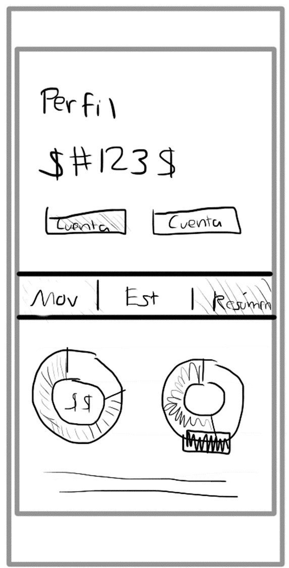
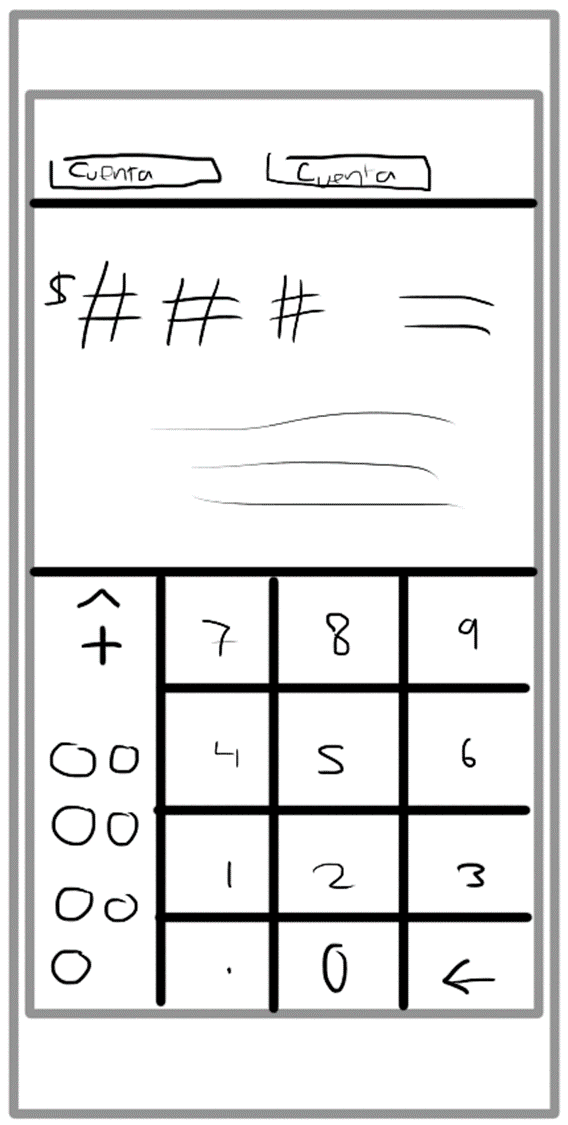
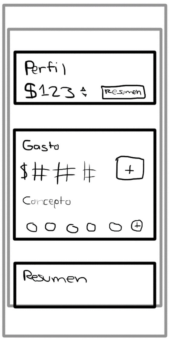
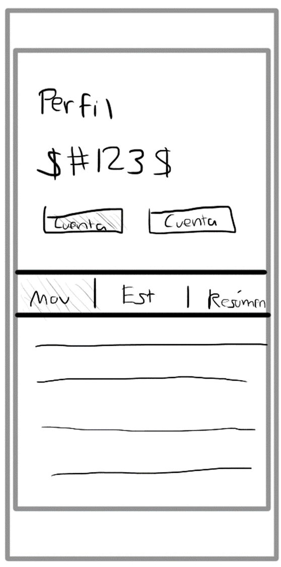
Sketch

Sketch

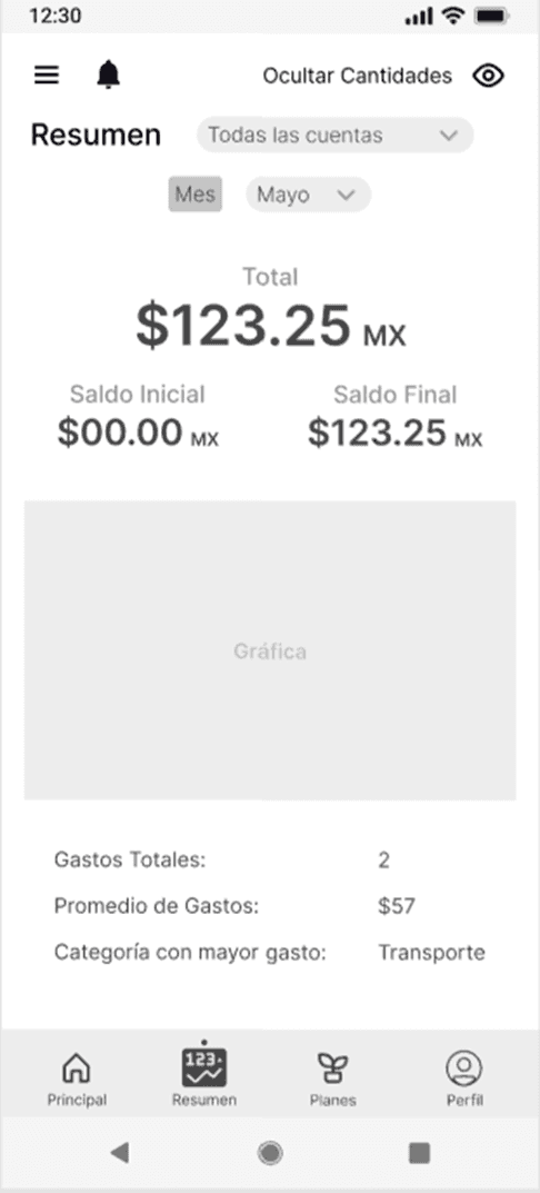
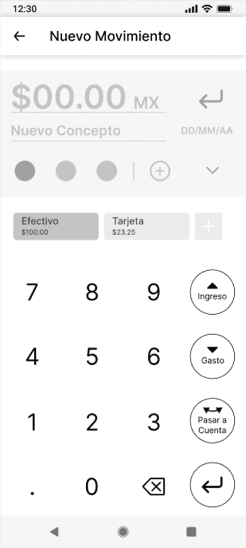
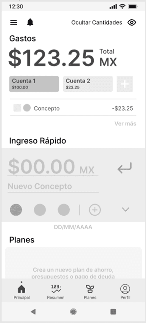
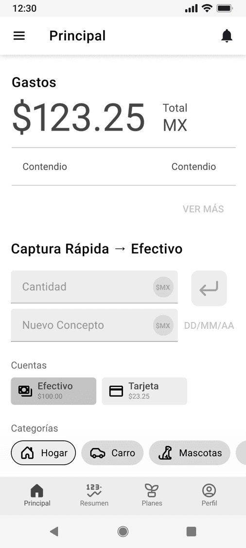
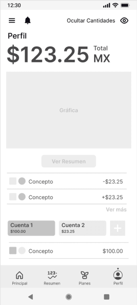
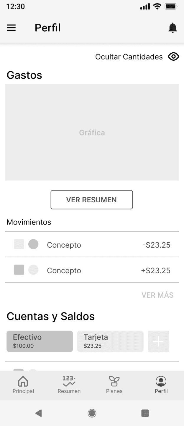
Mi-Fi Prototype

Mi-Fi Prototype

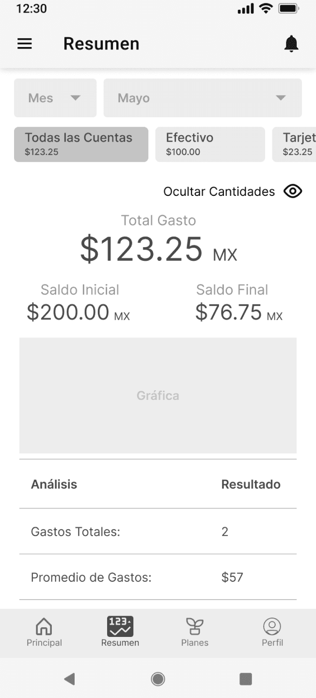
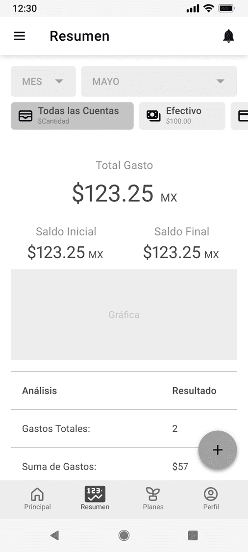
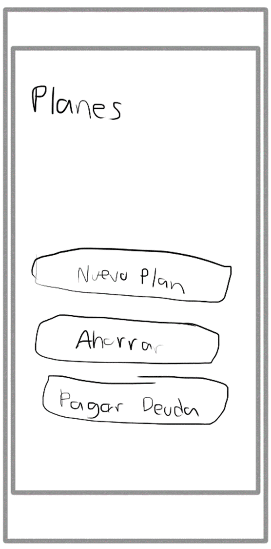
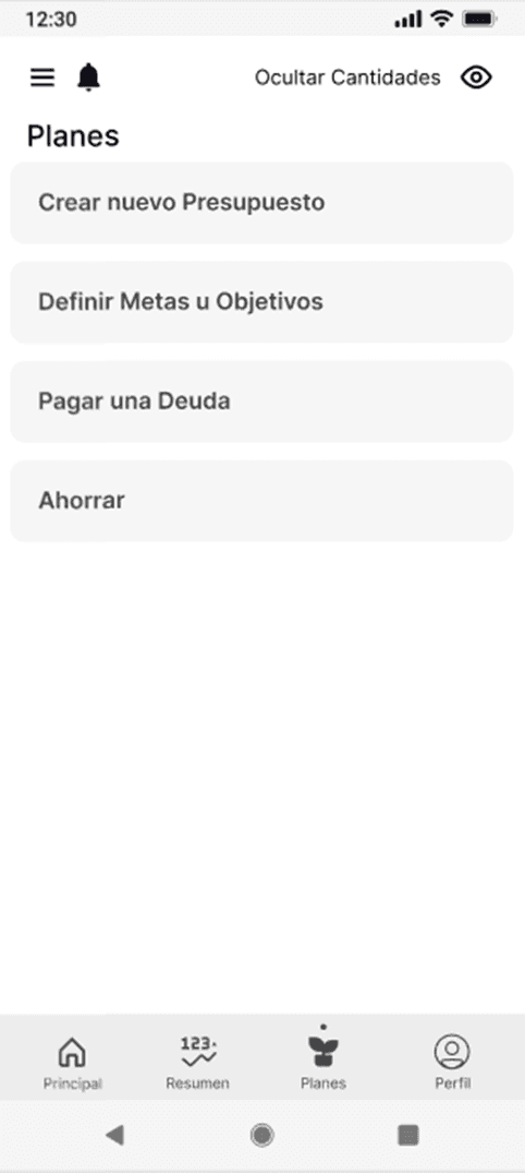
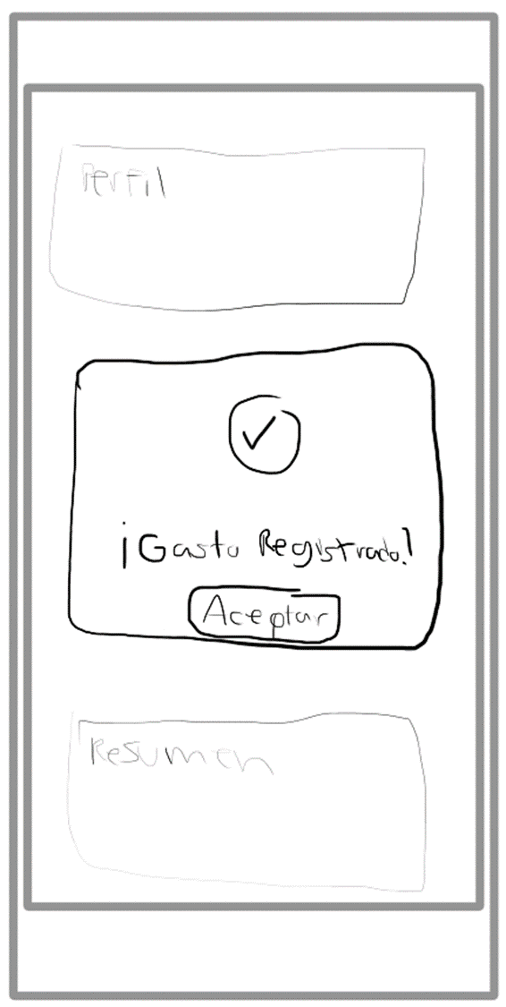
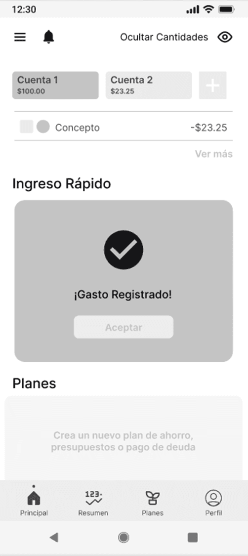
Low and Mid Fidelity Wireframes

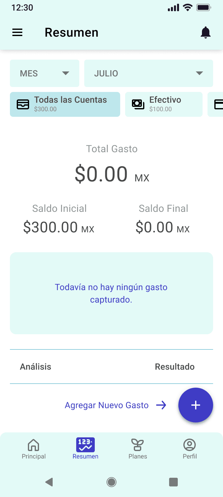
Report Screen
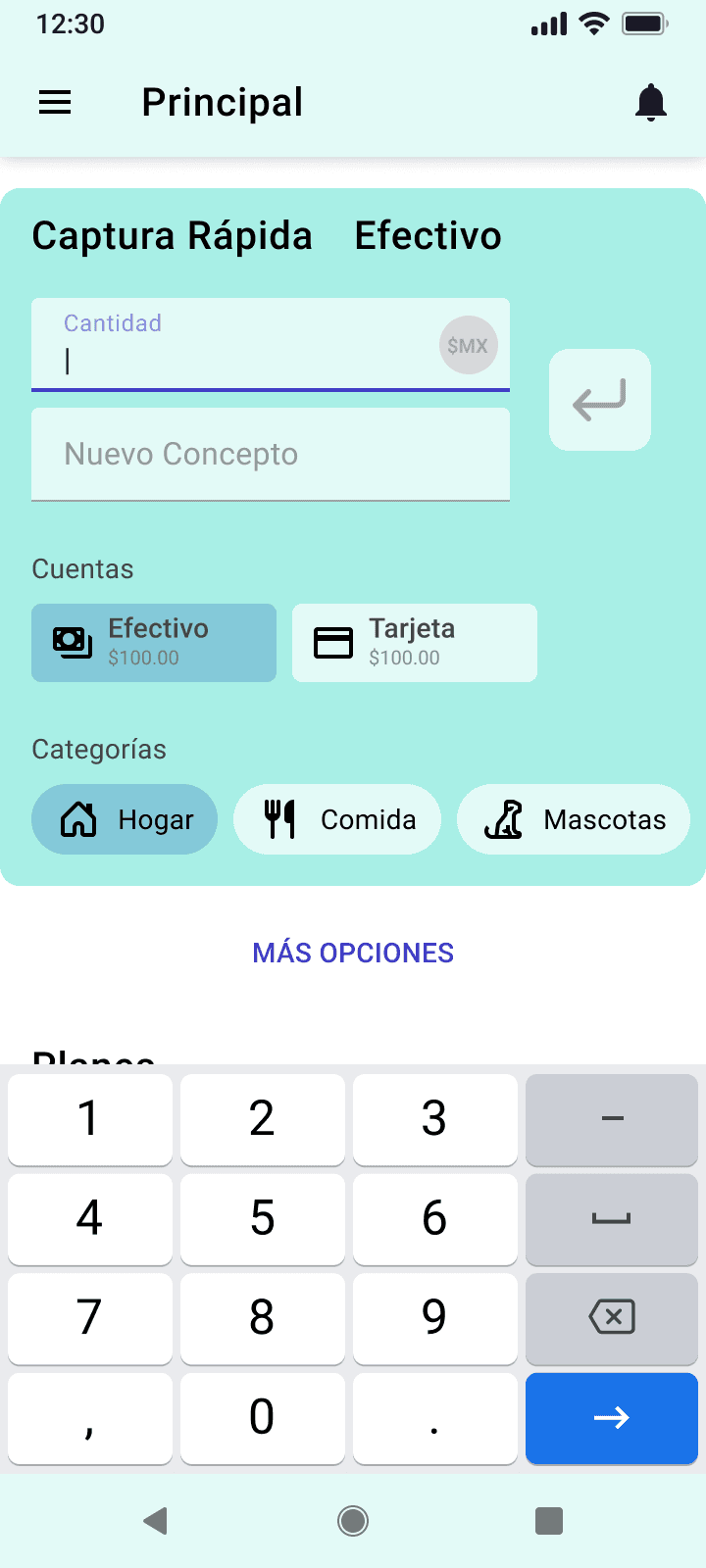
Register Screen
Home Screen

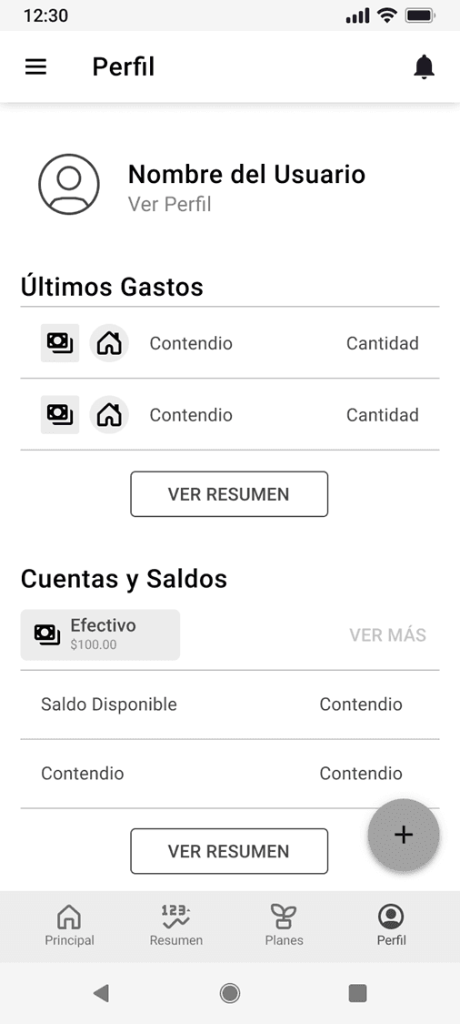
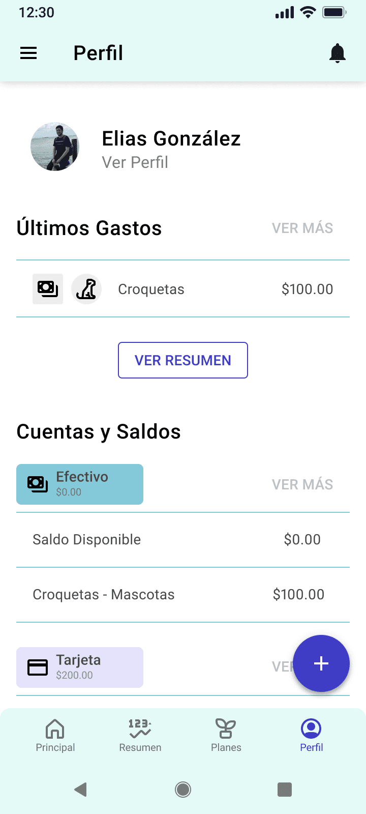
Profile Screen
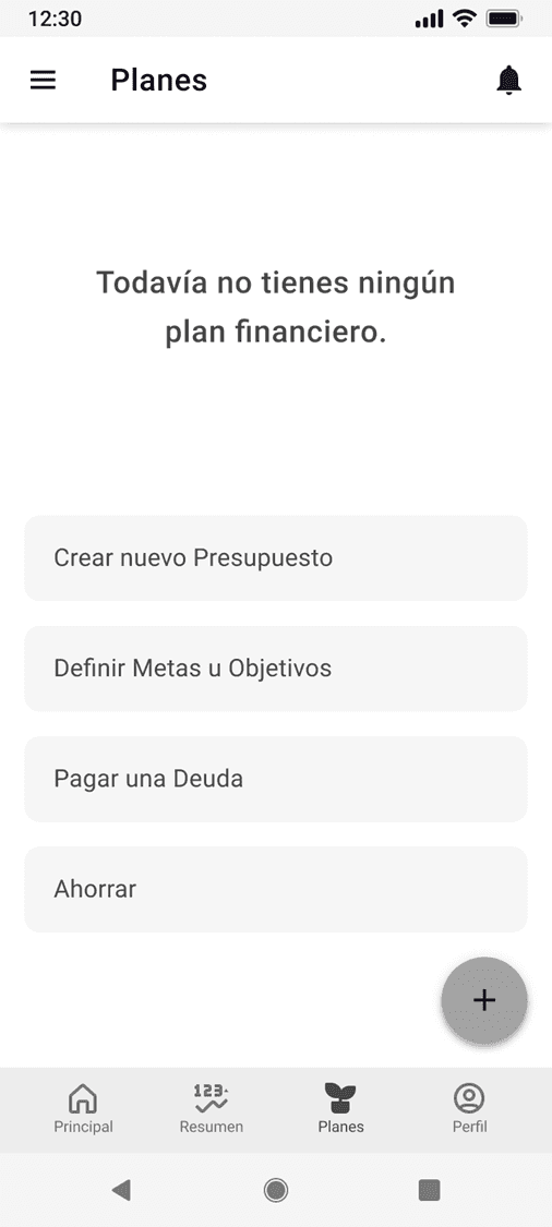
Planing Screen
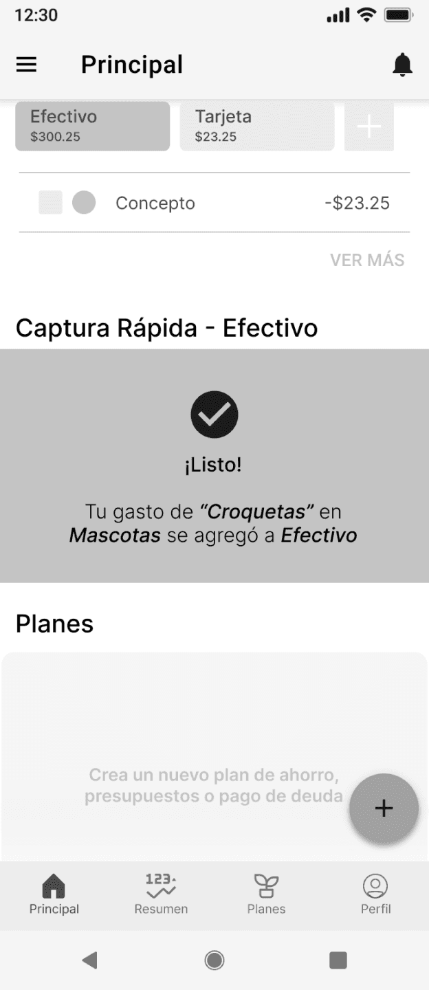
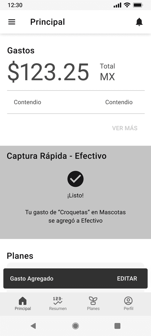
Confirmation Screen
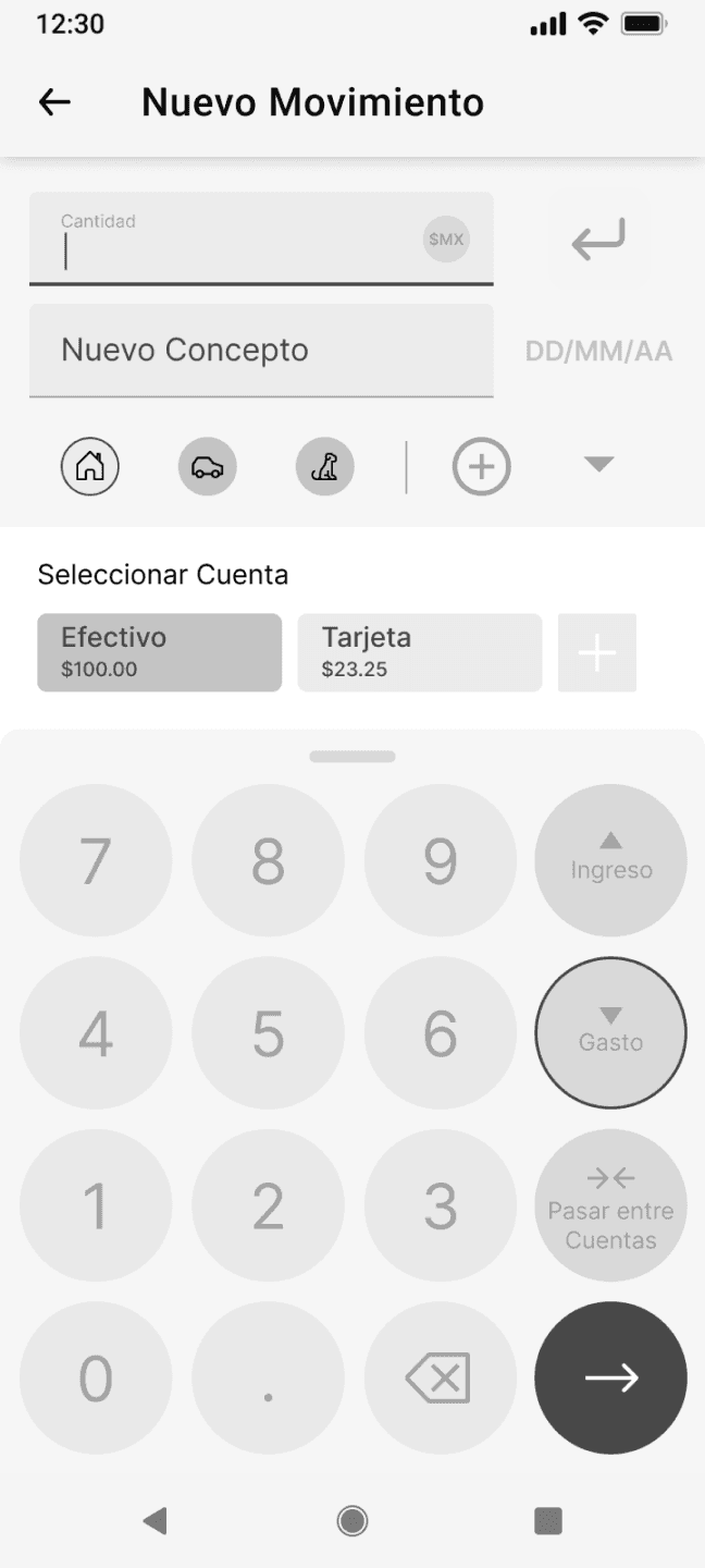
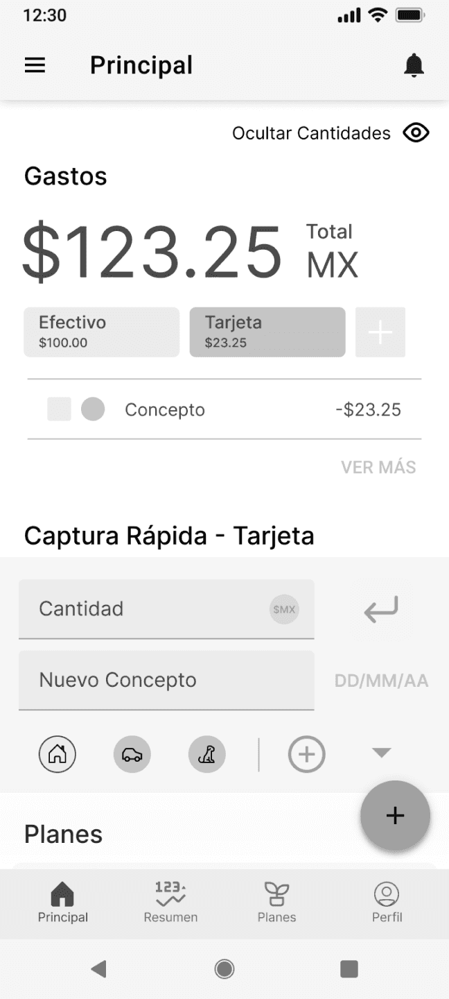
Evaluation and Iteration

Usability Tests

Usability Tests

Iteration

Iteration

Change Log

Change Log

Ui Design Kit

Ui Design Kit

Moodboard

Moodboard

Heuristics Evaluation

Heuristics Evaluation

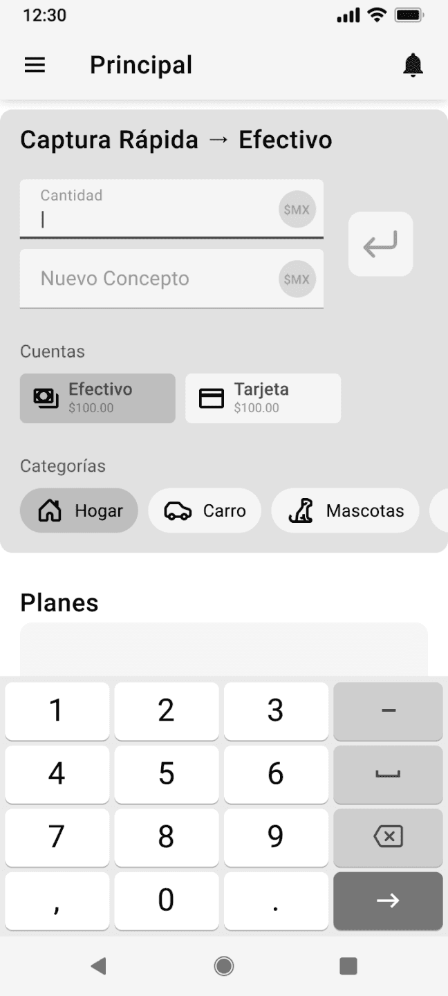
Hi-Fi Prototype

Hi-Fi Prototype

Iteration

Executative Summary

What worked
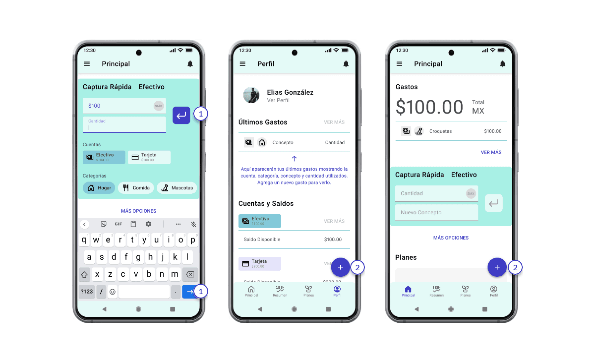
  • “Fast Register” was very attractive for the user.

  • Expense Summary shown on both “Summary” and “Profile”.

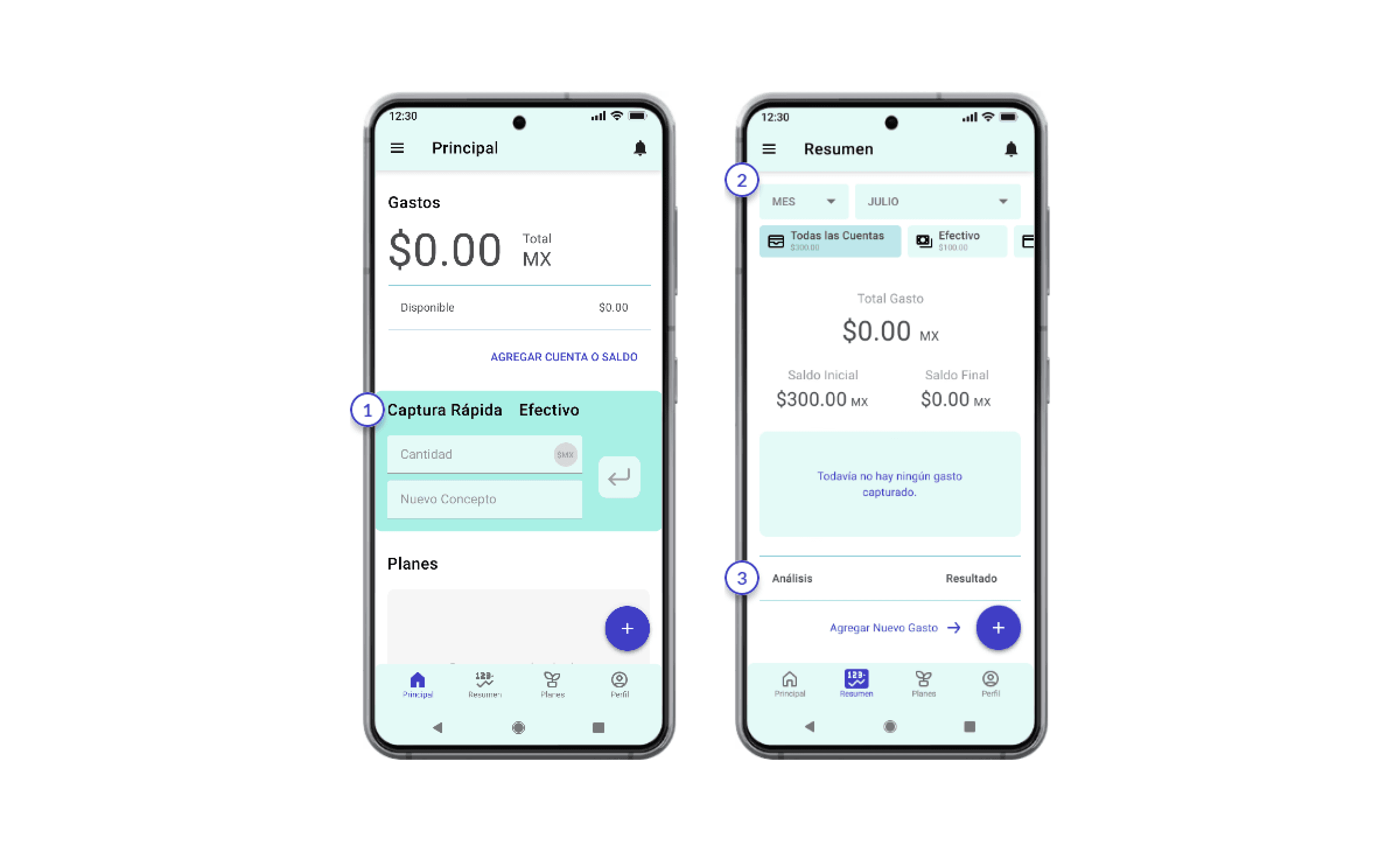
  • Summary with information displayed.

  • Navigation bar.

What didn´t worked
  • Floating button for registering an expense. It was unused on the test but for accessibility it will be kept.

  • Categories won’t work as should for visualisation.

Recomendations
  • Make categories icons bigger and interchangable.

  • Information needs to be consistent between pages.

  • Add color.

  • Check if “Hide quantities” bottun is really needed.

  • Add icons to accounts.

  • Have a default activated account at from the beggining.

  • Make more atractive expenses summary tab.

  • Graphics must be simplier.

  • Delete date token, it is missinterpreted for an input.

  • Change enter icon to avoid missinterpretation.

  • Change text “Add pay method” for an icon.

  • In Accounts change plus button for another sign to avoid confuse on adding another movement.

  • Simplify information of home.

  • Delete reports on profile page.

  • Change avarage expenses for total expenses.

Changes indicator based on recommendations:
Changed for las version
Pendent for revision

UI Design Kit

Material Design for Android

  • Typography Roboto (Android)

    Light 112sp

    Regular 56sp

    Display 4

    Display 3

    Regular 45sp

    Display 2

    Regular 34sp

    Display 1

    Regular 24sp

    Headline

    Regular 20sp

    Title

    Regular 16sp (Device/Mobile)

    Regular 15sp (Desktop)

    Subheading

    Medium 14sp (Device/Mobile)

    Medium 13sp (Desktop)

    Body 2

    Regular 14sp (Device/Mobile)

    Regular 13sp (Desktop)

    Body 1

    Caption 12sp

    Caption

    MEDIUM (ALL CAPS) 14sp

    Button

  • Primary Color

    R

    G

    B


    Hex

    227

    250

    247


    E3FAF7

    Secondary Color

    R

    G

    B


    Hex

    132

    201

    217


    84C9D9

    Accent Color

    R

    G

    B


    Hex

    63

    60

    197


    3F3CC5

    Secondary

    Accent Color

    R

    G

    B


    Hex

    63

    60

    197


    FF937C

    Rule of 60:30:10

    Tone Variations

    Gray Scale

    Cromatic Code

  • Buttons and Control Elements

    Buttons

    Primary

    Category

    Accounts

    Normal

    Pressed

    Selected

    Unselected

    Inactive

    Secondary

    Tertiary

    Enter

    F.A.B.

    Selector Control - Chip

    Control - Switch

    Control - Radio button

    Botón

    Botón

    Botón

    Botón

    Botón

    Botón

    Botón

    Botón

    Botón

    Etiqueta

    Etiqueta

    Cuenta

    $Saldo

    Cuenta

    $Saldo

  • lip

    Klip

    Klip

    Icon Design

    Small = 44x44

    Icon App

    Medium = 240 x 80

    Large = 280 x 120

    Extra Large = 340 x 190

  • Iconography

    $MX

    Active Icons

    $MX

    Inactive Icons

  • Forms and Inputs Elements

    Text-Fields

    Menu

    $MX

    Cantidad

    $MX

    Cantidad

    Cantidad

    $MX

    Cantidad

    $MX

    Cantidad

    Cantidad

    Texto

    Texto

    Texto

    Texto

    Normal

    Pressed

    With Color

    Icon

  • Bar Elements

    Principal

    Resumen

    Planes

    Perfil

    Principal

    Principal

    Top Bar

    Tool Bar

    Bottom-Navigation

    Navigation Bar

    Snack Bar

    12:30

    Texto

    Editar

  • Typography Roboto (Android)

    Light 112sp

    Regular 56sp

    Display 4

    Display 3

    Regular 45sp

    Display 2

    Regular 34sp

    Display 1

    Regular 24sp

    Headline

    Regular 20sp

    Title

    Regular 16sp (Device/Mobile)

    Regular 15sp (Desktop)

    Subheading

    Medium 14sp (Device/Mobile)

    Medium 13sp (Desktop)

    Body 2

    Regular 14sp (Device/Mobile)

    Regular 13sp (Desktop)

    Body 1

    Caption 12sp

    Caption

    MEDIUM (ALL CAPS) 14sp

    Button

  • Primary Color

    R

    G

    B


    Hex

    227

    250

    247


    E3FAF7

    Secondary Color

    R

    G

    B


    Hex

    132

    201

    217


    84C9D9

    Accent Color

    R

    G

    B


    Hex

    63

    60

    197


    3F3CC5

    Secondary

    Accent Color

    R

    G

    B


    Hex

    63

    60

    197


    FF937C

    Rule of 60:30:10

    Tone Variations

    Gray Scale

    Cromatic Code

  • Buttons and Control Elements

    Buttons

    Primary

    Category

    Accounts

    Normal

    Pressed

    Selected

    Unselected

    Inactive

    Secondary

    Tertiary

    Enter

    F.A.B.

    Selector Control - Chip

    Control - Switch

    Control - Radio button

    Botón

    Botón

    Botón

    Botón

    Botón

    Botón

    Botón

    Botón

    Botón

    Etiqueta

    Etiqueta

    Cuenta

    $Saldo

    Cuenta

    $Saldo

  • lip

    Klip

    Klip

    Icon Design

    Small = 44x44

    Icon App

    Medium = 240 x 80

    Large = 280 x 120

    Extra Large = 340 x 190

  • Iconography

    $MX

    Active Icons

    $MX

    Inactive Icons

  • Forms and Inputs Elements

    Text-Fields

    Menu

    $MX

    Cantidad

    $MX

    Cantidad

    Cantidad

    $MX

    Cantidad

    $MX

    Cantidad

    Cantidad

    Texto

    Texto

    Texto

    Texto

    Normal

    Pressed

    With Color

    Icon

  • Bar Elements

    Principal

    Resumen

    Planes

    Perfil

    Principal

    Principal

    Top Bar

    Tool Bar

    Bottom-Navigation

    Navigation Bar

    Snack Bar

    12:30

    Texto

    Editar

Moodboard

Finances, Trust, Comfort

Heuristics Evaluation (Nielsen)

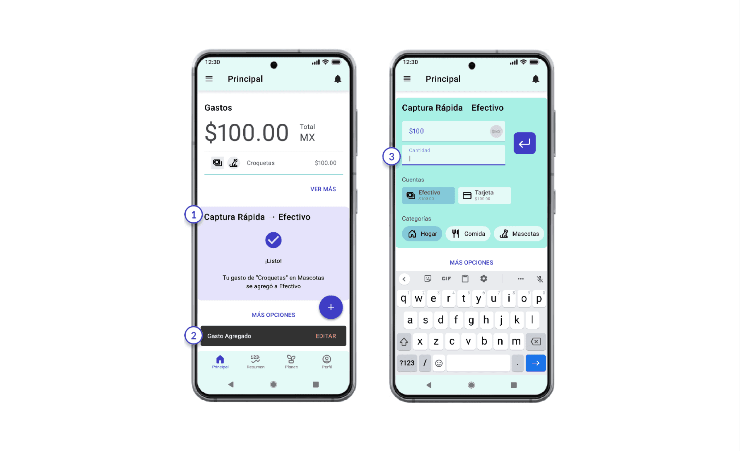
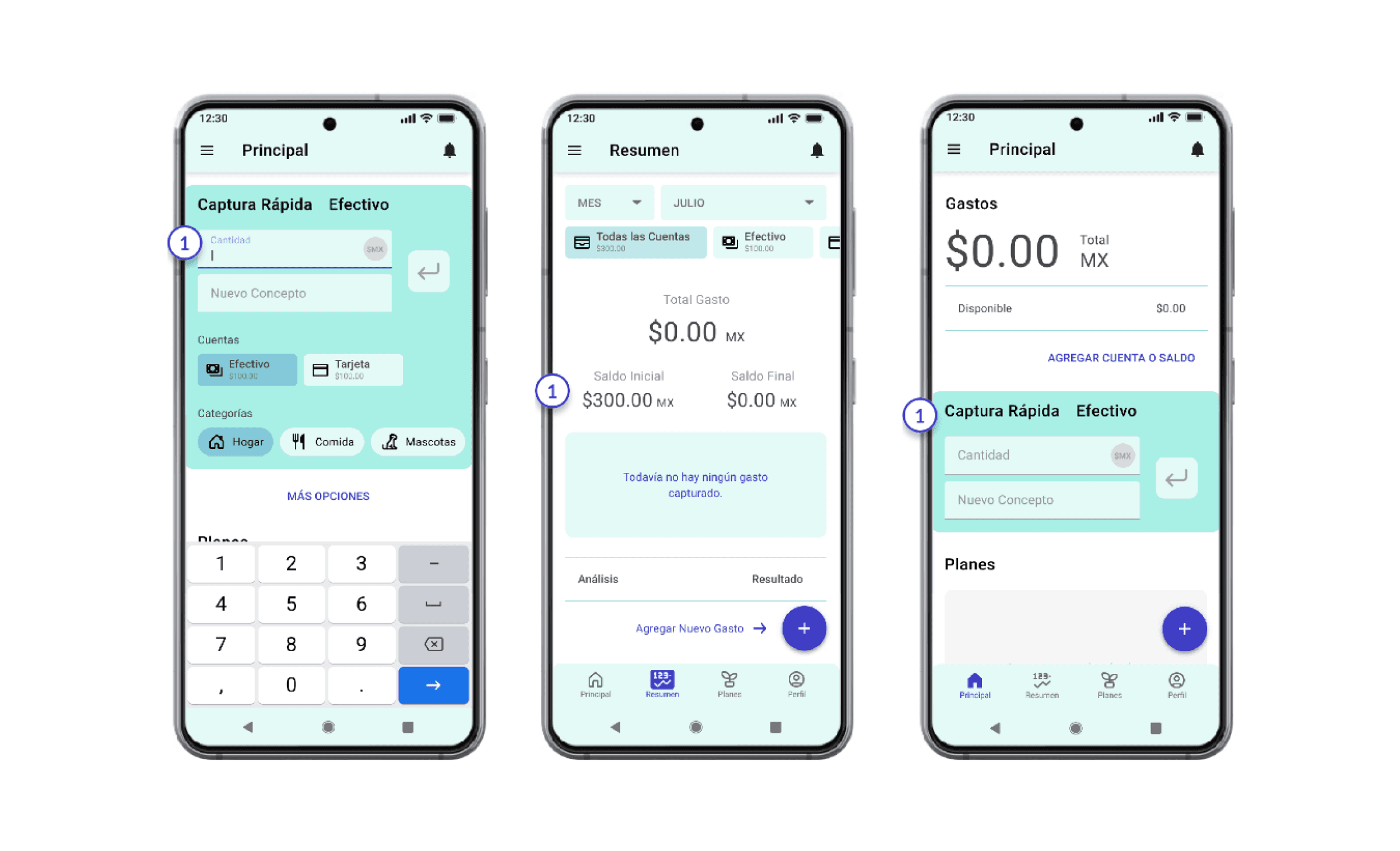
Visibility of system status
  1. Feedback.

  2. Snack-bar feedback.

  3. Text-field highlighted when selected.
Match between system and the real world
  1. Use of same concepts through the app´s pages.
User control and freedom
  1. Switches on accounts and categories.

  2. Snack-bar for error recovery.

User control and freedom
  1. Switches on accounts and categories

  2. Snack-bar for error recovery.

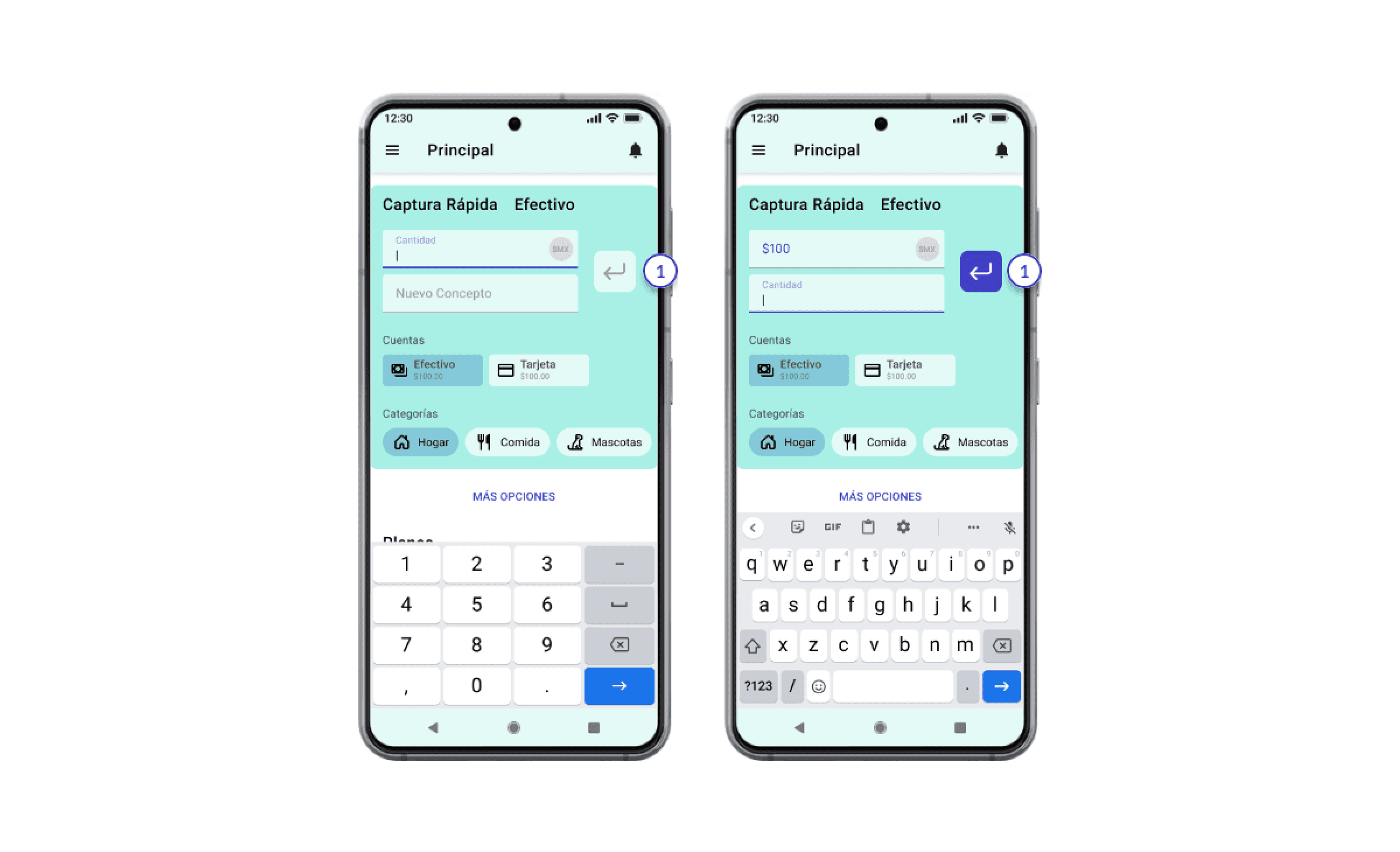
Help users recognize, diagnose, and recover from error
  1. Enter button can only be activated after completing the minimum input fields.
Consistency and standards
  1. Use of categories and accounts with visible balances.

  2. Last expense history.

Recognition rather than recall
  1. Two buttons for registering expense.

  2. Register from any screen with F.A.B.

Flexibility and efficiency of use
  1. Card for fast register is simplified if not used.

  2. All-in-one account overview.

  3. Short copy texts.

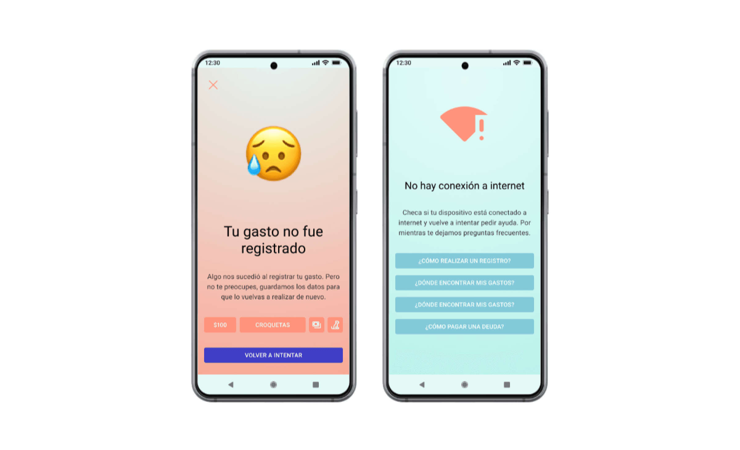
Aesthetic and minimalist design
  1. The core functions of the app cannot be completed if there is an incorrect or empty input.
Help and Documentation
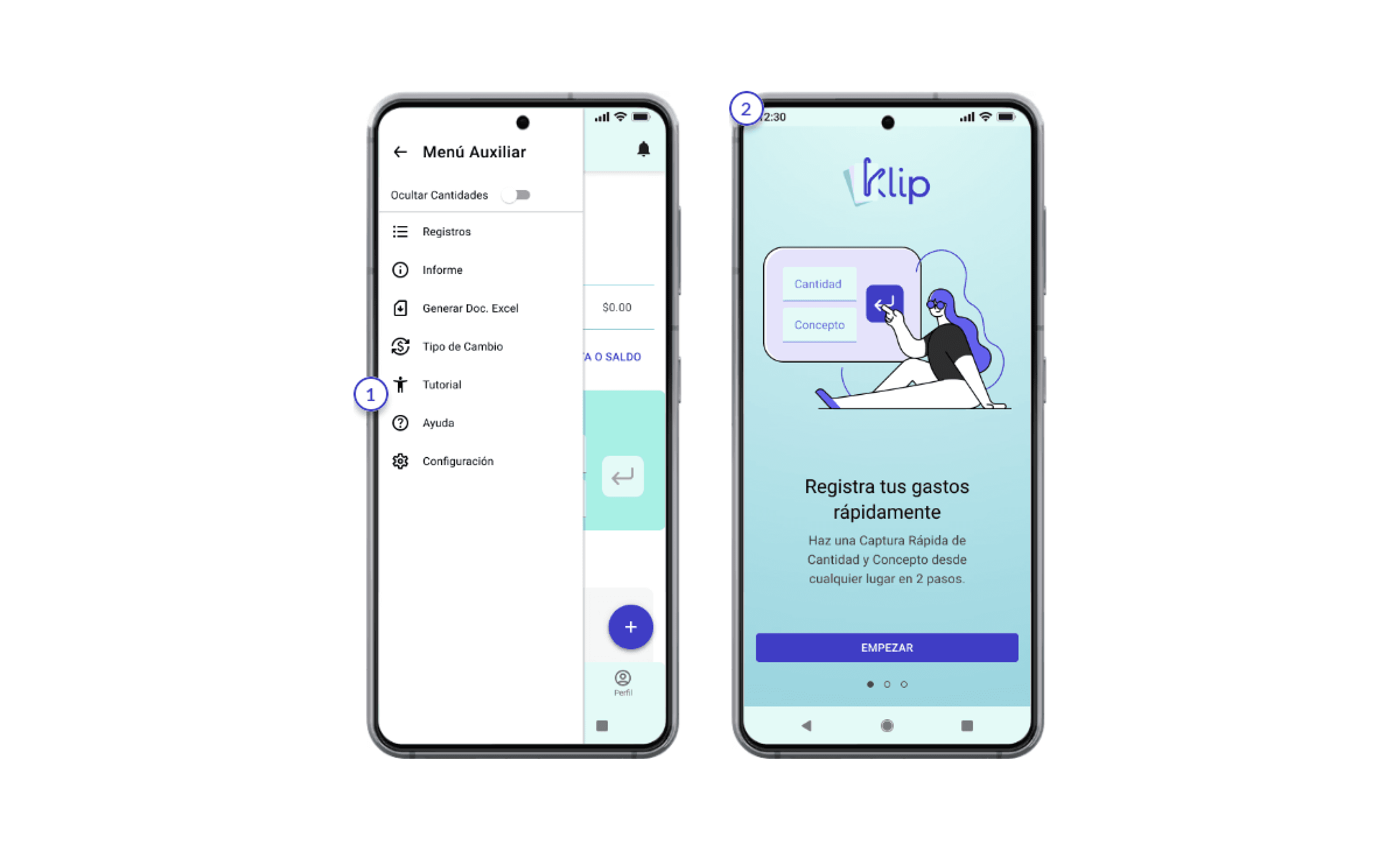
  1. Tutorial and Help in hamburger menu.

  2. Onboarding of the MVP´s functions.

Try it yourself

Prototype only in Spanish.

Explore more

Project orginally made in Spanish

REACH OUT

Click to copy

All rights reserved

REACH OUT

Click to copy

All rights reserved

Create a free website with Framer, the website builder loved by startups, designers and agencies.